The greatest gift of the garden is the restoration of the five senses.
~Hanna Rion
Our mission is as follows:

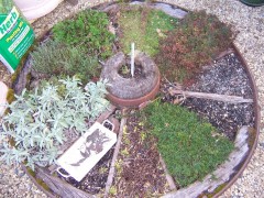
An old wagon wheel makes an attractive
divider for herbs.
Photographed by Brendan Gasparin.
Wagon wheel by Harmony Garden Centre, Lauderdale.
Used with permission.
To support the principles of organic gardening, and to dispense quality information on practices relating to organic gardening.
To provide the reader with helpful information related to those practices, including appropriate times to plant, methods of soil treatment such as mulching and composting, and ways to preserve the health of plants through methods such as companion planting and the use of organic, natural pest control.
To spread awareness of the advantages of organic methods of gardening, as well as the disadvantages presented by chemical methods of fertilisation and pest control, and to inform the reader of ways in which the food produced by an organic garden will have superior health and nutritive qualities over foods produced by inorganic and chemical methods.
The Organic Gardening in Tasmania website is aimed at a wide audience of local Tasmanians, from children to the elderly, as gardening is a hobby that can and will be enjoyed by people of all ages. This target audience has heavily influenced the design and layout of our website.

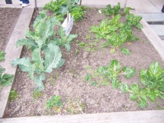
A simple, open and spacious layout.
Photographed by Brendan Gasparin.
A simple, open, and spacious layout was chosen to be easy on the eye, to hold the attention of younger viewers, and to provide an interface that is easy to understand even for those who are not necessarily familiar with the more complex aspects of the World Wide Web. The menu on the left provides a simple and intuitive standard method for the user to easily navigate to other sections, and may be accessed from any page on the website.
Bright, natural colours were chosen, once again to attract and hold the attention of younger viewers, and to remain easy on the eye. The choices of greens, browns, yellows and oranges are also intended to simulate the colours one might find in a home garden, as this is the subject with which our site is concerned. Lighter shades were used to prevent the colour scheme from becoming too gaudy and overwhelming. In particular, the lighter colours used for the sections containing the main text content and the simple black used for the text itself were chosen to preserve readability of the text and to avoid straining the reader's eyes. Large and simple sans-serif fonts were used to ensure that the site is easily read by older visitors and those who may have trouble reading smaller type.
